Block Grid in Umbraco: Basics
What is Block Grid in Umbraco?
Block Grid is a data type that lets you build rich, structured layouts using "blocks" (which are essentially element types or document types) inside a grid-like editor.
Define custom blocks (e.g. text block, image block, banner, call-to-action)
Control how they are laid out (e.g. columns, rows, spanning)
Let editors build flexible pages without rigid templates
How to set up a Block Grid in Umbraco
Create your block element types
Go to:
Settings > Document Types > Element Types
Create new Element Type(s) (these are your blocks)
For example:
-
Hero Block (fields: heading, image, button link)
-
Text + Image Block (fields: text, image)
-
CTA Block (fields: button text, link)
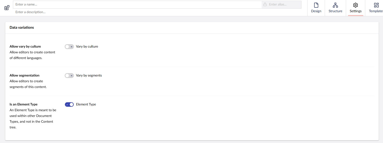
You must check the “Is an element type” box (located under the Settings tab in the top-right corner) to allow it to be used inside Block Lists, Block Grids, Nested Content, etc.
Otherwise, it’s treated as a full Document Type and can’t be used as a content block.
Create the Block Grid data type
Go to:
➡ Settings > Data Types
➡ Add new Block Grid
➡ In the Block Grid config:
-
Add your block types (select from the element types you created)
-
Configure allowed grid columns (e.g. 12 for a 12-column grid)
What are Size Options?
When you're setting up a block for the Block Grid, Size Options let you control:
-
How wide the block is
-
How many columns it takes up
-
If it stretches the full row or sits next to other blocks
Think of it like Lego blocks on a grid — some are small, some are wide.
Basic Settings You’ll See:
-
Grid Columns (e.g. 12-column grid)
-
The Block Grid usually works on a 12-column layout
-
So if a block uses:
-
12 columns = full width
-
6 columns = half width
-
4 columns = one-third width
-
-
-
Min and Max Size
-
You can limit how wide or narrow a block can be
-
Example:
-
Min size: 4
-
Max size: 8
-
The editor can choose a width between 4–8 columns
-
-
-
Default Size
-
This is the starting size when the block is first added
-
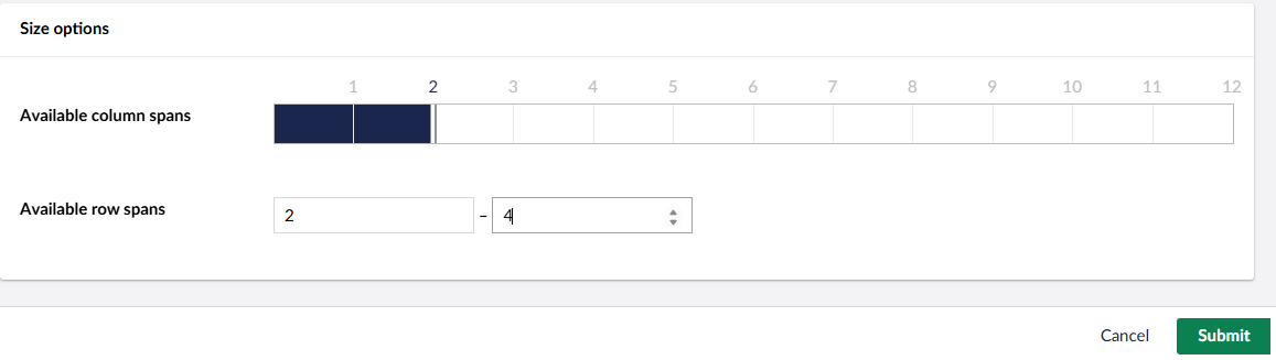
What are Available Row Spans?
Just like Size Options control width (how many columns a block spans),
Available Row Spans control height (how many rows a block takes up).
Example:
-
If a block has row spans: 1, 2, 3:
-
Span of 1 = normal height
-
Span of 2 = twice as tall
-
Span of 3 = takes up 3 rows of vertical space
-
This is useful when:
-
You want tall hero blocks
-
Or make some blocks stand out more than others
💡Bonus Tip
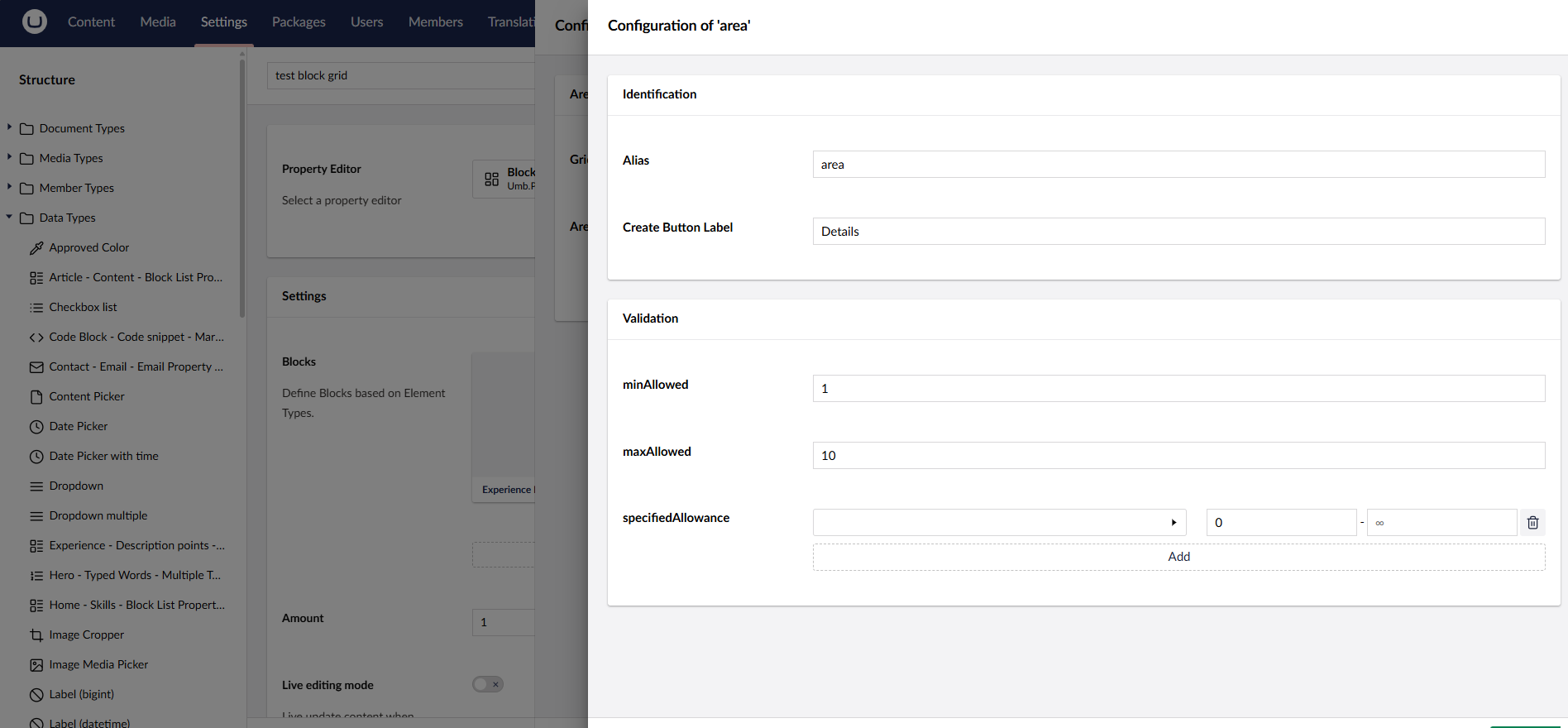
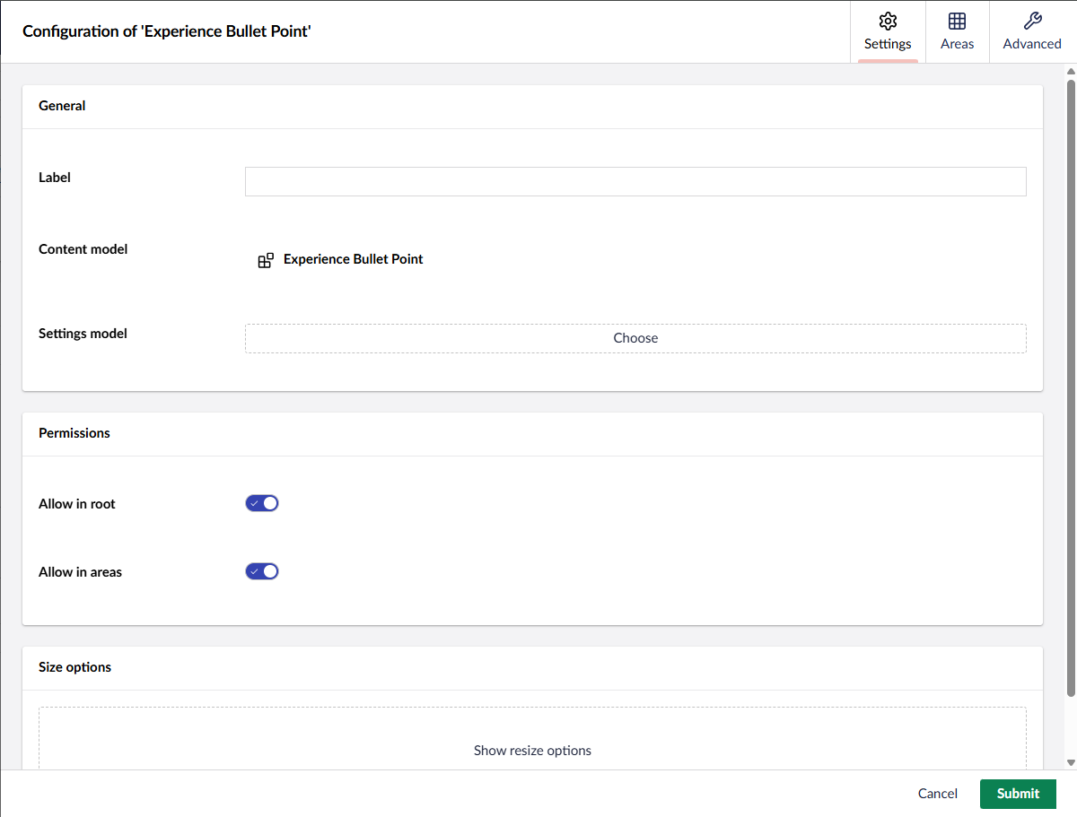
You can nest block types within each other by using "Allow in root" and "Allow in areas"
-
"Allow in areas" → This allows a block to be placed inside another block’s defined area (e.g., a column in a two-column layout).
-
"Allow in root" → This allows a block to be placed directly in the grid, not nested inside anything.
When nesting blocks inside root-level layout blocks, you can control which blocks are allowed in each area by going to the 'Areas' tab when configuring the layout block. Click the pencil icon (✏️) next to an area, and from there you can choose which blocks are allowed in that area, and set minimum and maximum limits."
💡 Breakdown:
-
Create a layout block (e.g. Two Column Layout).
-
In its Block Grid config, go to the Areas tab.
-
Click the ✏️ edit icon next to an area (e.g. "Left Column").
-
A window pops up where you can:
-
✅ Choose which block types are allowed in that area
-
➕ Set Min / Max items
-
💬 Give the area a name/alias
-
-